Responsive Website Design
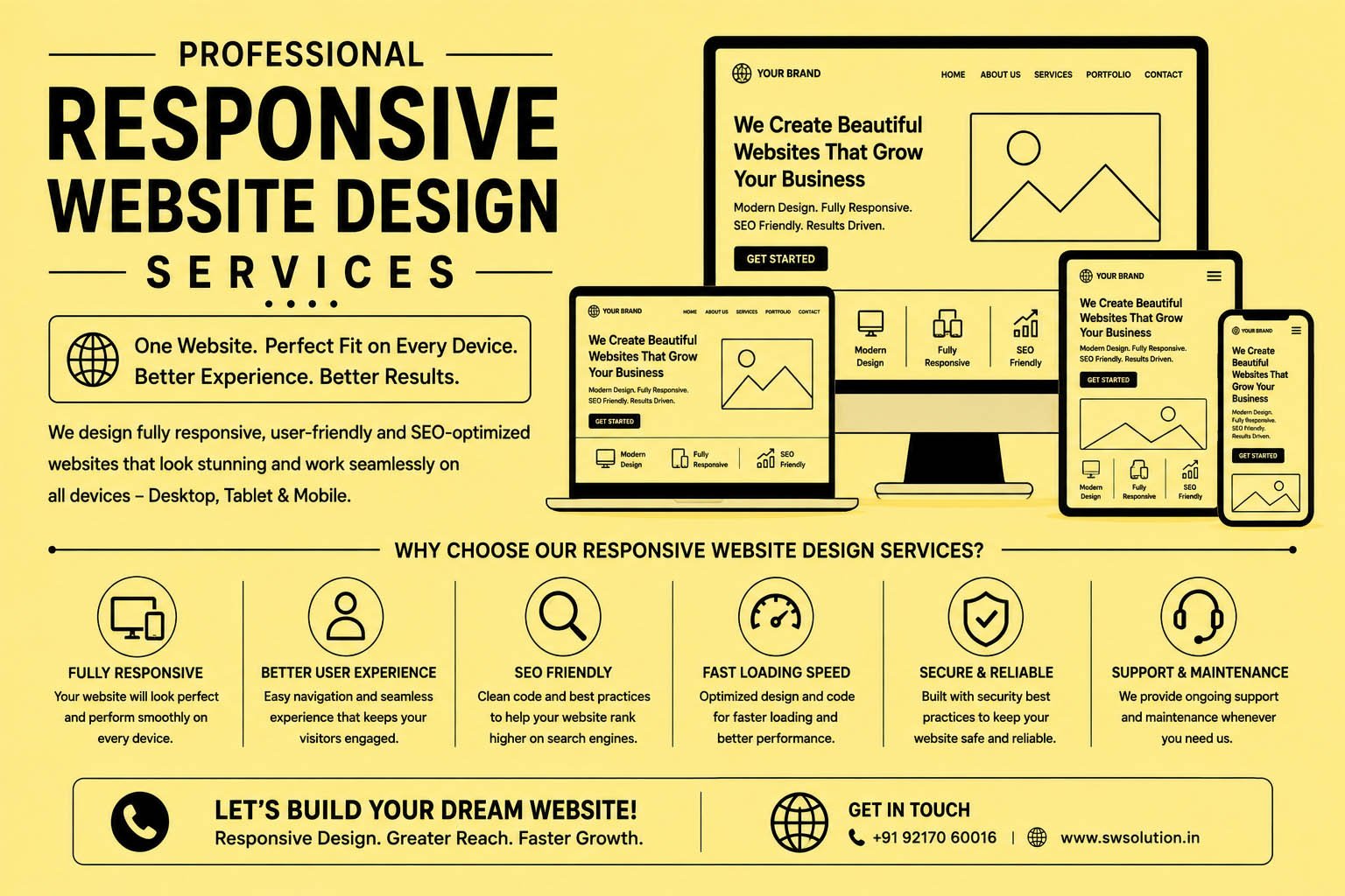
Responsive Website Design
About 5 min read
Learn why responsive website design is essential for modern businesses. Discover its benefits, SEO advantages, best practices, and how it improves user experience across all devices.
What Is Responsive Website Design?
Imagine visiting a website on your smartphone and having to zoom in just to read the text. The menu is difficult to click, images look broken, and finding information becomes frustrating. Most users won't stay for long. They'll leave and visit another website that offers a better experience.
This is exactly why responsive website design has become one of the most important aspects of modern web development.
Responsive website design is an approach that allows a website to automatically adjust its layout, images, text, and functionality according to the screen size being used. Whether a visitor accesses your website from a desktop computer, tablet, laptop, or smartphone, the website delivers a smooth and user-friendly experience.
In today's digital landscape, where more than half of all web traffic comes from mobile devices, having a responsive website is no longer optional—it's essential.
Why Responsive Website Design Matters
Consumer behavior has changed dramatically over the past decade. People search for products, compare services, read reviews, and make purchasing decisions directly from their smartphones.
If your website isn't optimized for mobile devices, you risk losing potential customers before they even learn about your business.
A responsive website helps businesses:
- Improve user experience
- Increase website engagement
- Reduce bounce rates
- Improve search engine rankings
- Generate more leads and sales
- Build trust with visitors
Simply put, a responsive website ensures that every visitor enjoys a seamless browsing experience regardless of the device they use.
How Responsive Website Design Works
Responsive design uses flexible layouts, adaptive images, and CSS media queries to automatically adjust content based on screen size.
Instead of creating separate websites for desktop and mobile users, a single responsive website adapts itself dynamically.
For example:
On Desktop
- Full navigation menu
- Large images
- Multiple content columns
On Tablet
- Simplified navigation
- Optimized image sizes
- Adjusted content spacing
On Mobile
- Mobile-friendly menus
- Larger buttons for touch screens
- Single-column layout
- Faster page loading
This adaptability helps create a consistent experience across all devices.
Benefits of Responsive Website Design
Improved User Experience
User experience is one of the biggest factors that determine whether visitors stay on your website or leave.
A responsive website offers:
- Easy navigation
- Readable text
- Fast loading pages
- Touch-friendly buttons
- Better accessibility
When visitors enjoy browsing your website, they are more likely to engage with your content and contact your business.
Better Search Engine Rankings
Google uses mobile-first indexing, which means it primarily evaluates the mobile version of your website when determining search rankings.
A responsive website can contribute to:
- Better SEO performance
- Higher rankings
- Increased organic traffic
- Improved crawlability
Businesses that invest in responsive design often see better visibility in search engine results.
Increased Mobile Traffic
Mobile internet usage continues to grow every year.
A responsive website allows businesses to capture and convert mobile visitors more effectively.
Without responsive design, mobile users may abandon your site and choose a competitor with a better browsing experience.
Higher Conversion Rates
Every business website has a goal:
- Generate leads
- Sell products
- Book appointments
- Receive inquiries
Responsive design removes barriers that prevent visitors from taking action.
The easier it is for users to navigate your website, the more likely they are to convert.
Cost-Effective Website Management
Maintaining separate desktop and mobile websites can be expensive and time-consuming.
Responsive website design allows businesses to manage a single website that works across all devices.
This saves:
- Development costs
- Maintenance expenses
- Content management time
Responsive Design and Local SEO
For local businesses, responsive website design plays a critical role in local SEO success.
Many customers search for services while on the go using smartphones.
Examples include:
- Website Design Company Near Me
- Digital Marketing Agency in Gurgaon
- Restaurant Near Me
- Dentist in Gurgaon
When users find your business through local searches, they expect a smooth mobile experience.
A responsive website improves:
- Mobile usability
- Local search visibility
- Customer engagement
- Lead generation
This is especially important for businesses targeting customers within specific cities or service areas.
Key Features of a Responsive Website
Flexible Layouts
Content automatically adjusts to different screen sizes without breaking the design.
Responsive Images
Images scale appropriately to fit the available screen space.
Mobile-Friendly Navigation
Menus become easier to use on smaller screens.
Fast Loading Speed
Performance optimization ensures quick page loading across devices.
Touch-Friendly Design
Buttons and forms are optimized for mobile users.
Consistent Branding
Your brand identity remains consistent regardless of device.
Common Mistakes Businesses Make
Many websites still struggle because they overlook important responsive design principles.
Common mistakes include:
- Tiny text sizes
- Slow loading pages
- Unclickable buttons
- Poor navigation
- Oversized images
- Pop-ups that block content
- Broken layouts on mobile devices
Addressing these issues can dramatically improve website performance and user satisfaction.
Best Practices for Responsive Website Design
Prioritize Mobile Users
Design with mobile users in mind from the beginning.
Optimize Website Speed
Compress images and reduce unnecessary code to improve performance.
Use Responsive Typography
Ensure text remains readable on all screen sizes.
Test Across Devices
Regular testing helps identify issues before visitors encounter them.
Keep Navigation Simple
Users should find information quickly and easily.
Focus on User Experience
Every design decision should enhance usability and accessibility.
How Responsive Website Design Impacts Business Growth
Responsive design influences several important business metrics:
- Website Traffic
- User Engagement
- Lead Generation
- Conversion Rates
- Customer Retention
- Search Engine Rankings
A well-designed responsive website serves as a powerful marketing tool that works around the clock to attract and convert potential customers.
Businesses that invest in mobile-friendly experiences often gain a competitive advantage over companies with outdated websites.
Meet Seema Web Solution
Watch our introduction to the team and the web design and digital marketing services we provide.
Rated 5.0 out of 5 from 62 Google reviews. Read our Google reviews.

Copyright © Seema Web Solution. All Rights Reserved

